Joseph Ricafort profile photo

Most data products show data. The best ones help people decide.

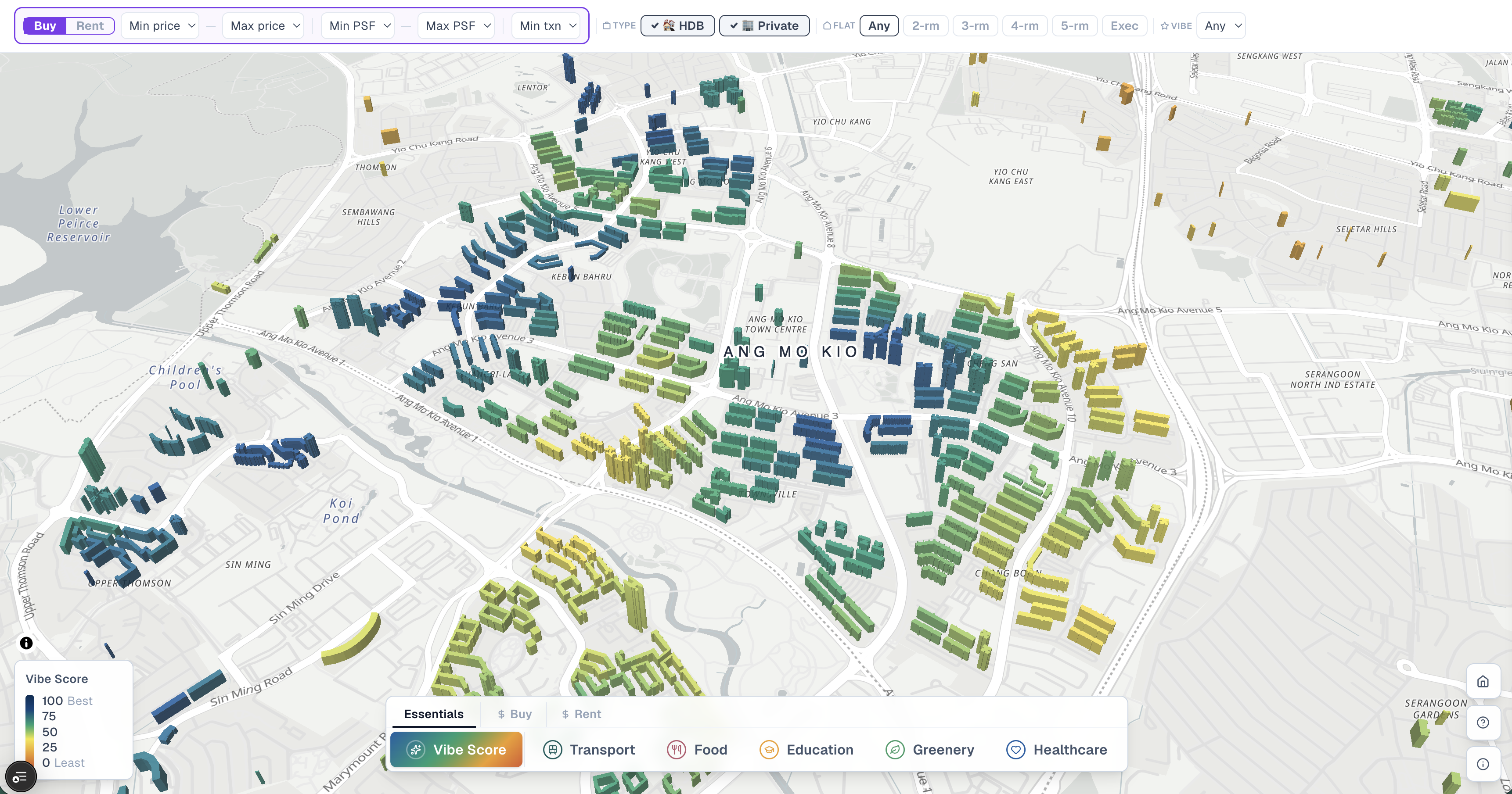
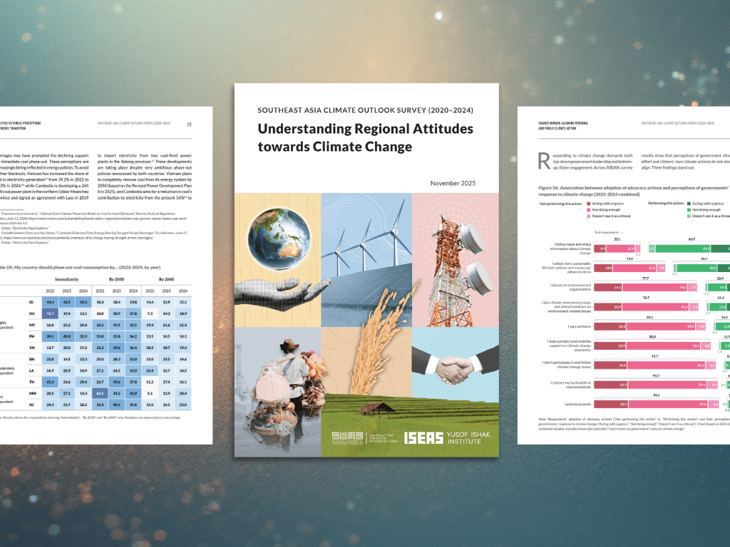
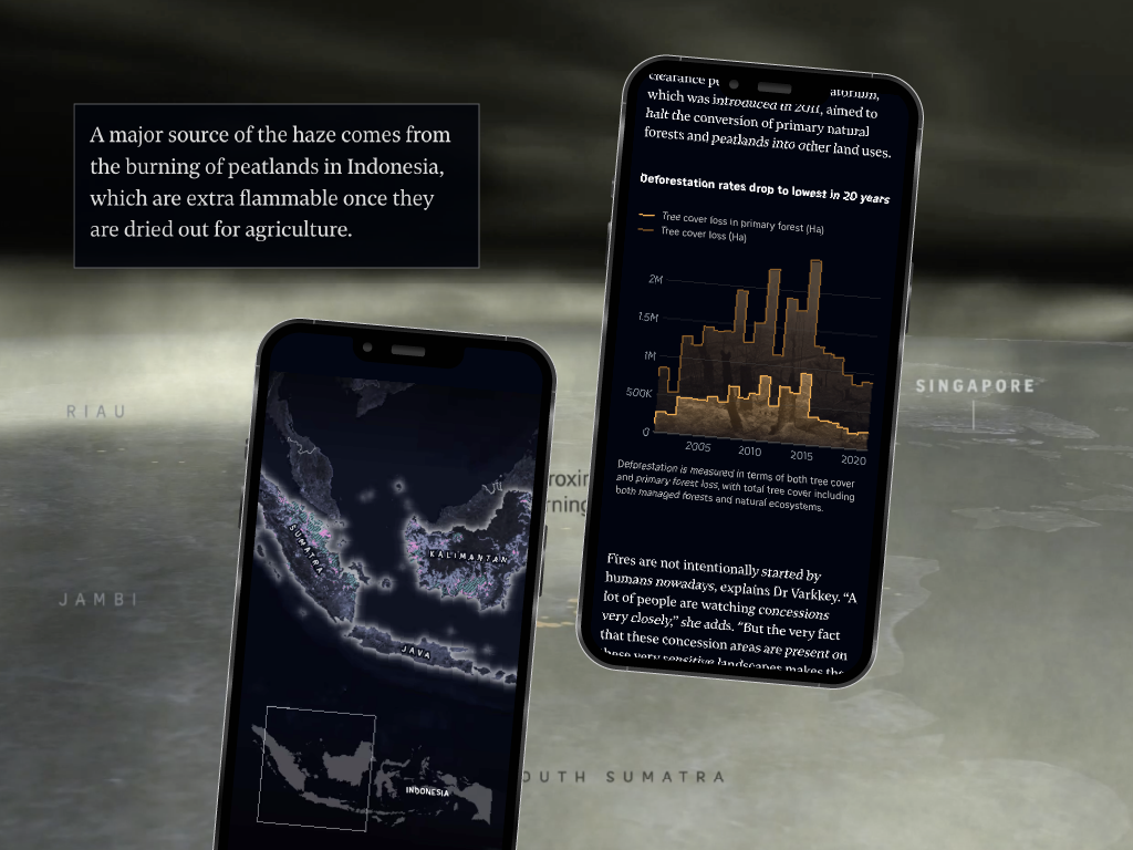
I'm Joseph Ricafort, a data visualization designer and creative developer. I build interactive maps, data explorers, scrollytelling experiences, and custom visualization tools — for startups and tech teams that need their data to drive decisions, not just fill dashboards. My work has been published by The Straits Times and ISEAS, and I've shipped products like VibeHood, a 3D neighbourhood explorer for Singapore's property market.

Whether you're building a data product, making sense of a complex dataset, or trying to close the gap between your data and the people who need to act on it — I can help you find the clearest path through.

Who I help
  • Research and policy teams
  • Newsrooms and publishers
  • Startups and product teams
Selected Work

Projects that turn complexity into clarity

Interactives

Help people discover data on their own

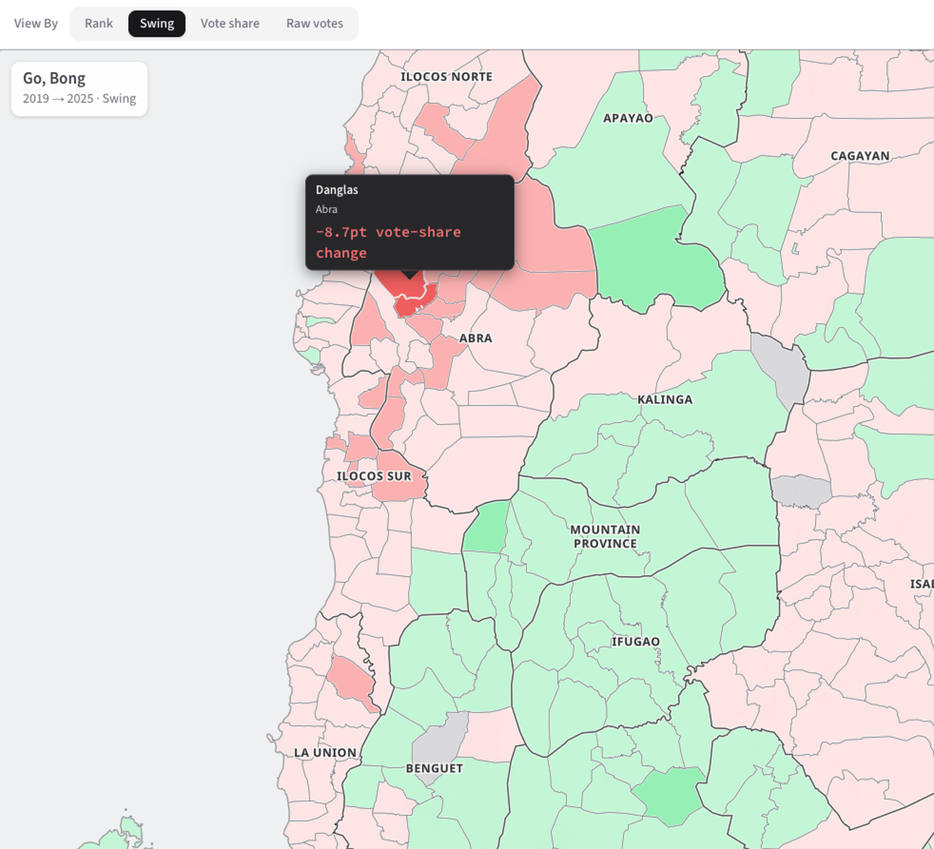
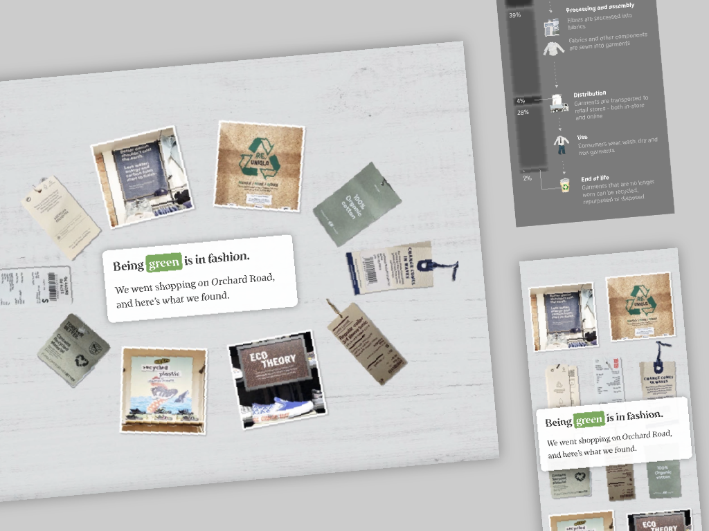
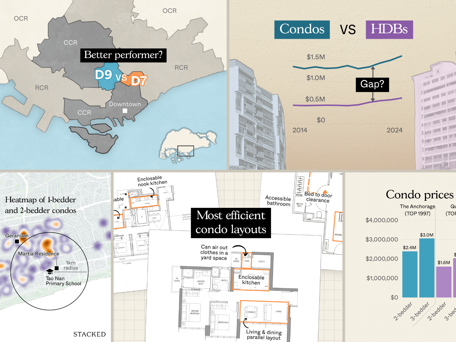
Give your audience a way to answer their own questions instead of squinting at a static chart. These interactive maps and explorers help people find what matters to them in property, history and collections data.

Stories

Get research findings read and understood

Research that stays in spreadsheets rarely gets used. These data stories and visual reports turn survey findings and evidence into something audiences can follow and act on, in print and on the web.

Graphics

Make one hard dataset clear at a glance

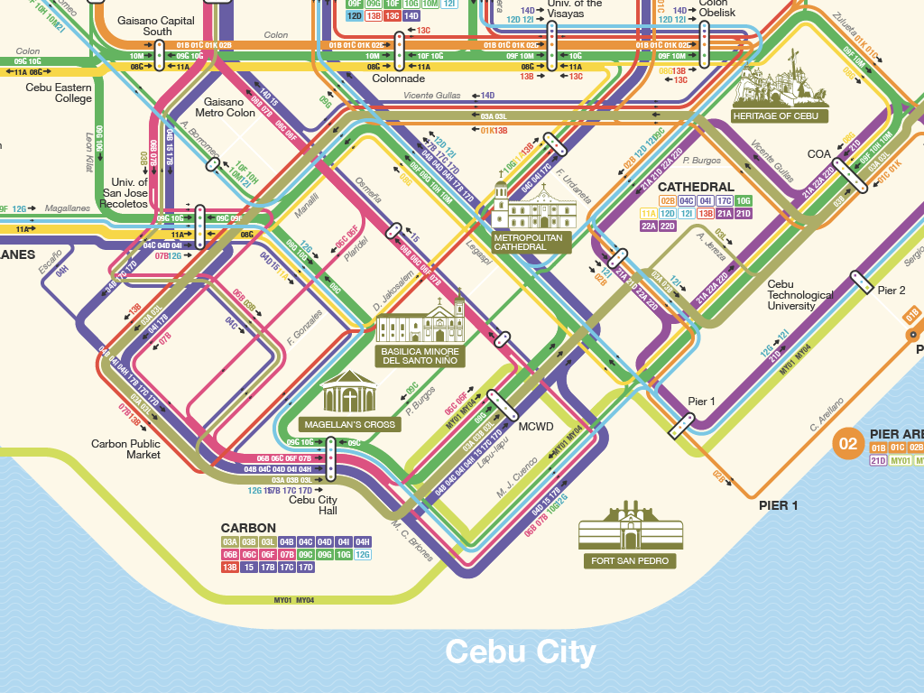
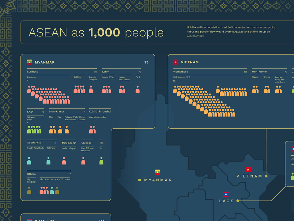
One map or chart that gets the point across in seconds. Thematic maps, infographics and chart systems that turn a complex spatial or statistical dataset into a single focused visual, so your team doesn't have to explain it.

Work that's shipped for publishers, research institutions, platforms, and startups

What clients say about our collaborations

Joseph is one of the most talented and creative designers on the team, capable of conceptualizing, developing, and executing a wide range of stories and styles, always maintaining the highest standard of quality. Additionally, he took charge of defining the mapping style guide for the newsroom.

Rodolfo Pazos
Interactive Graphics Editor
The Straits Times

Let's turn your data into something worth understanding — and beautiful to share.

If you're building a product, working with complex data, or need an experience that makes something hard to understand finally click — let's talk. Share what you're working on and I'll come back to you within two business days.