Builder's Log
Writing on data, design, and the space between
Technical process, philosophical takes, and case studies from building data-driven products and visualizations.
RSS FeedHow I Built VibeHood: A 3D Neighbourhood Explorer for Singapore
The technical and design decisions behind building a MapLibre 3D map product as a solo builder — from a personal frustration to a shipped product.
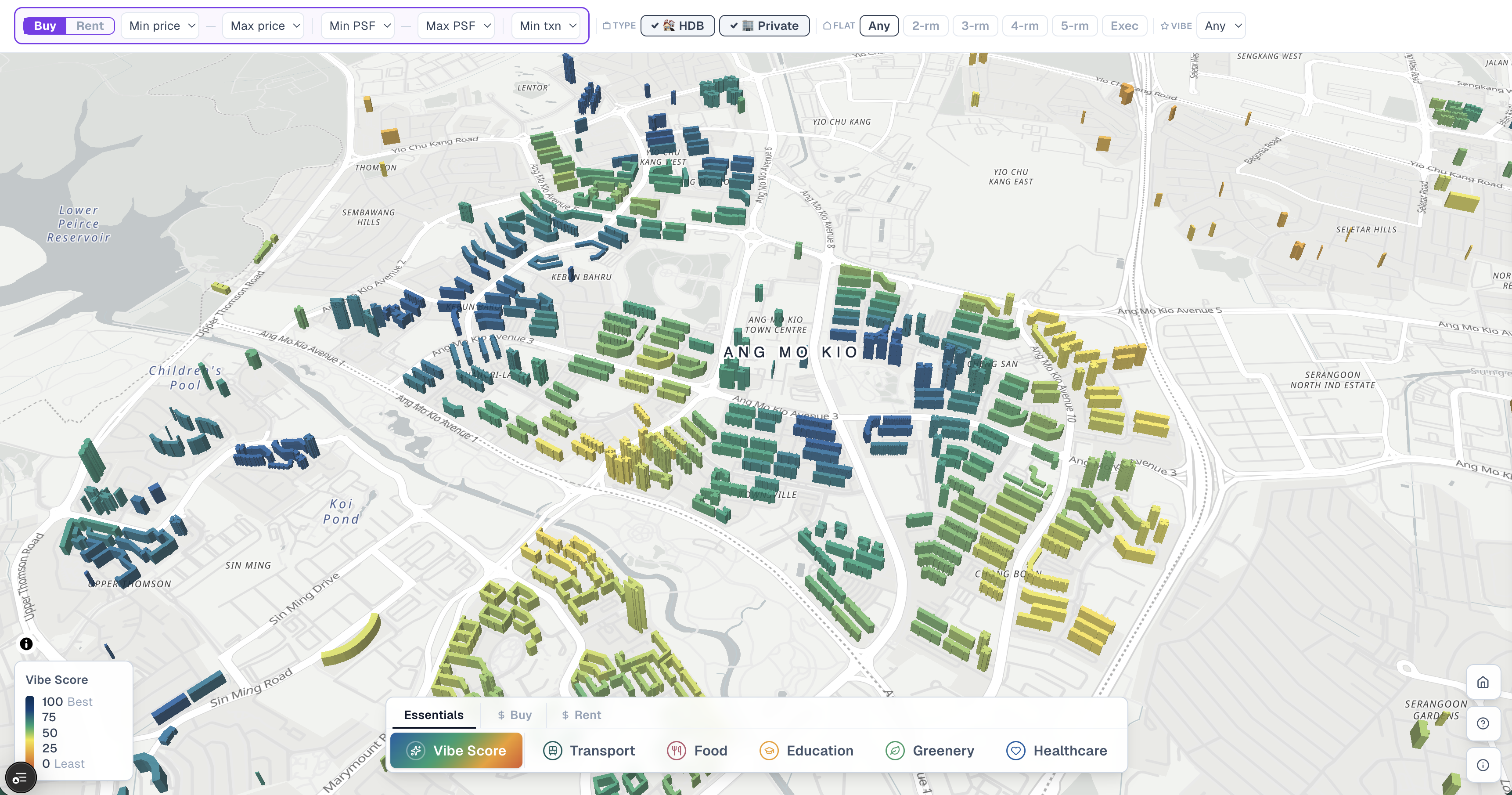
Turning Singapore Property Data into a Personalised Neighbourhood Explorer
An interactive 3D map of Singapore that helps home buyers and renters find neighbourhoods that fit their lifestyle — combining walkability scores, personalised vibe ratings, and real HDB/private transaction data.
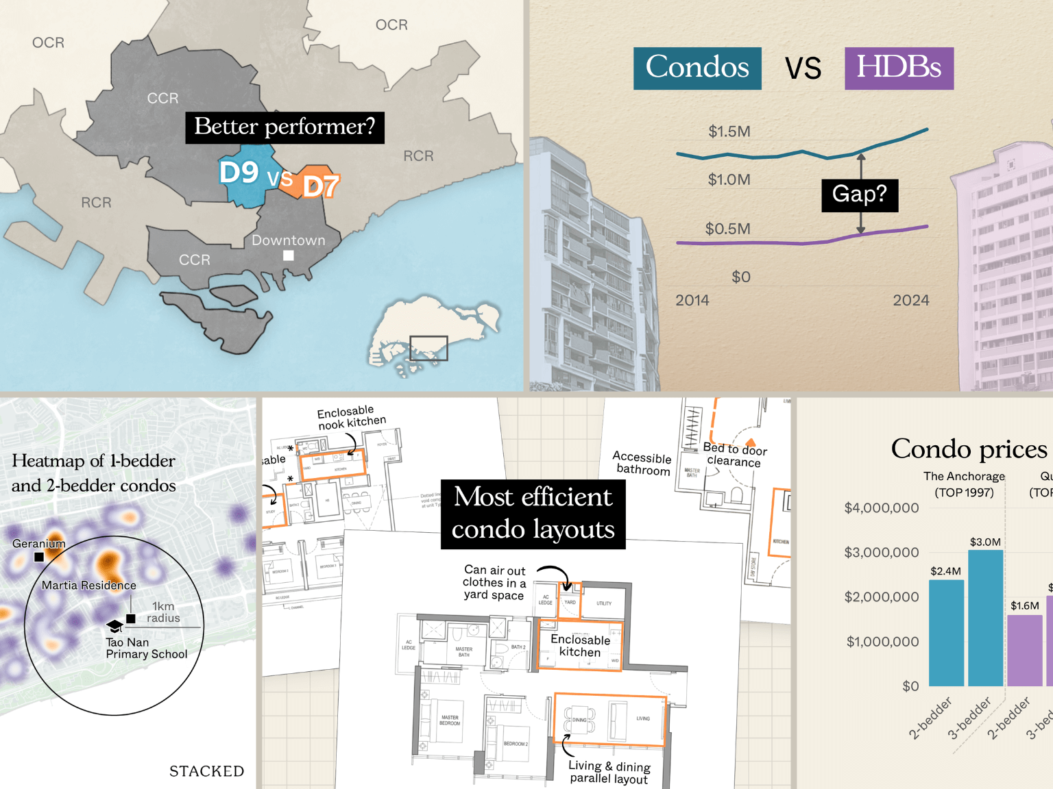
Getting Smarter with Stacked Graphics and Maps Creation Process
Editorial chart and map production for Singapore real estate publisher StackedHomes — data visualizations, maps, and feature graphics across 27 in-depth weekly articles.
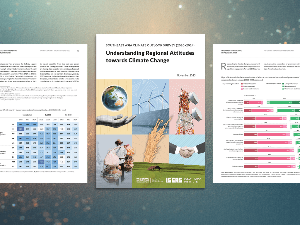
Southeast Asia Climate Outlook Survey 2020–2024
Design and visualization support for a multi-year climate perception study across Southeast Asia, transforming complex survey findings into clear, publication-ready graphics and social media assets.
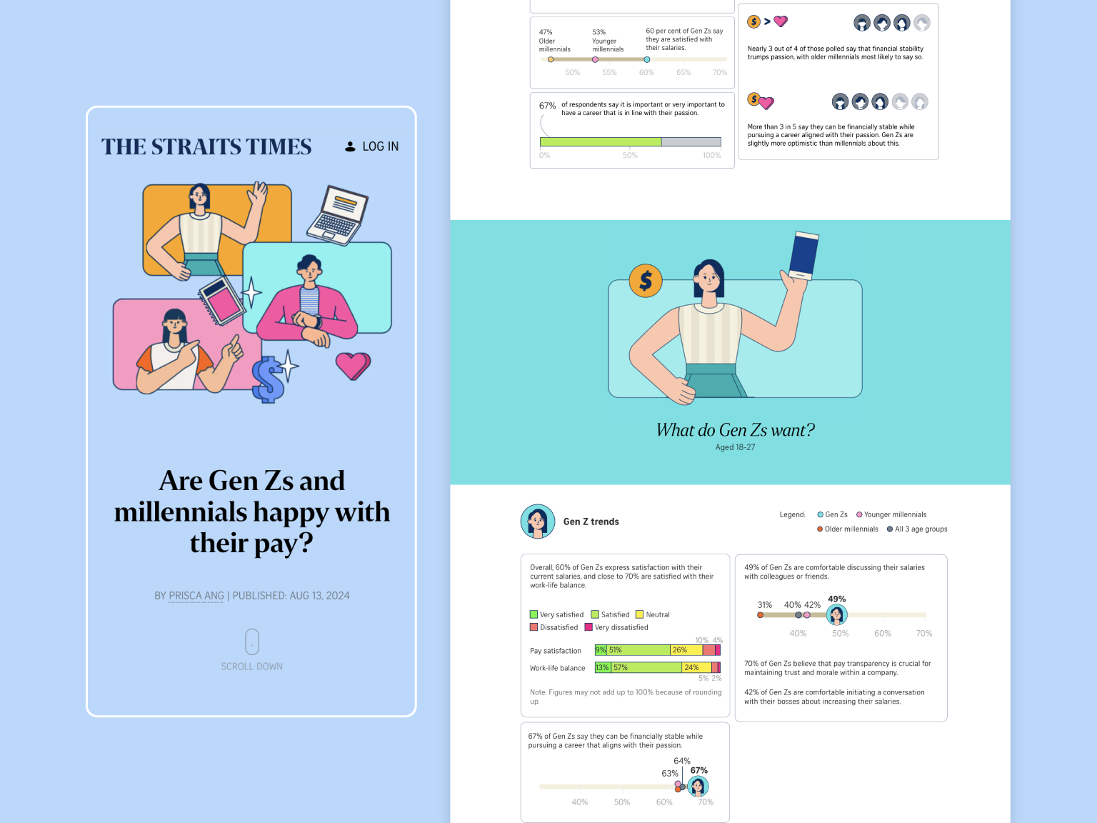
Survey data on generational pay satisfaction
A data story/report into the salary satisfaction and career aspirations of Genx X, Millennial and Gen Z workers in Singapore.

Transforming Universities into Innovation Hubs in Mali
Scrollytelling web report and print PDF presenting survey data on innovation needs across Malian universities — built for stakeholders using Svelte and Scrollama.
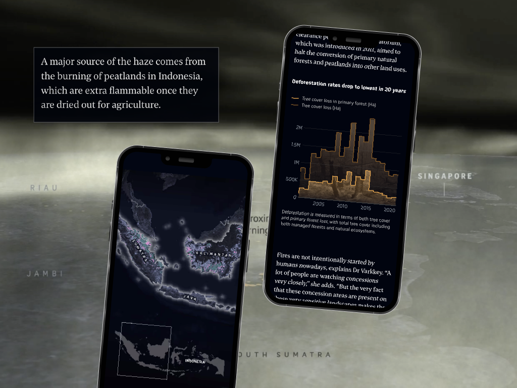
A Visual Explainer of Transboundary Haze in Southeast Asia
Award-winning interactive explainer on transboundary haze in Southeast Asia — combining geospatial data visualization, animated maps, and scrollytelling for The Straits Times.
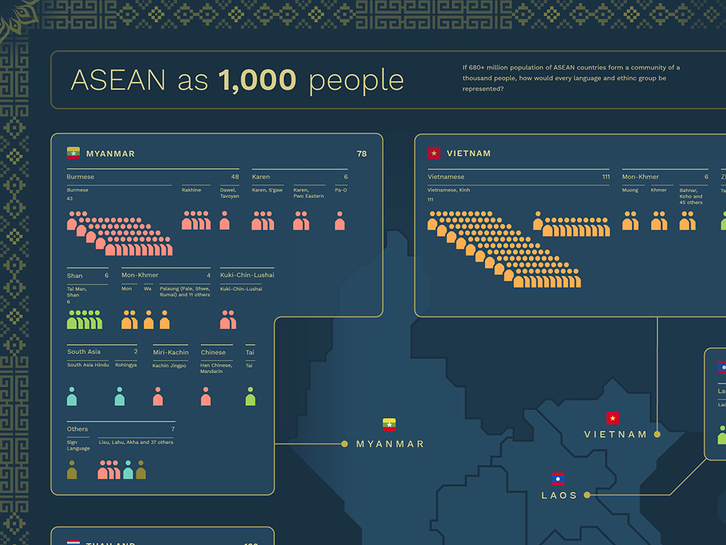
A More Approachable View on ASEAN Demographics
Infographic representing ASEAN's 660 million population as 1,000 people — making regional demographic data legible through custom illustration and R-based data analysis.
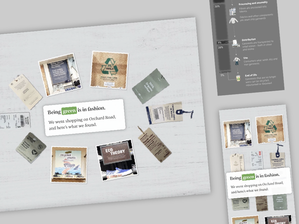
How A T-shirt Unveils Hidden Environmental Costs
An interactive story taking you through the journey of manufacturing a shirt and the environmental impact of fast fashion industry.

Clustering Solutions in Visualizing Museum Collections
Interactive D3.js network visualization for Museum Arnhem enabling visitors to explore the collection through dynamic clustering and connection mapping.

A Nation's Journey Through The Straits Times Headlines
Interactive scrollytelling story exploring 175 years of Singapore history through text analysis and D3.js visualization of The Straits Times headlines.
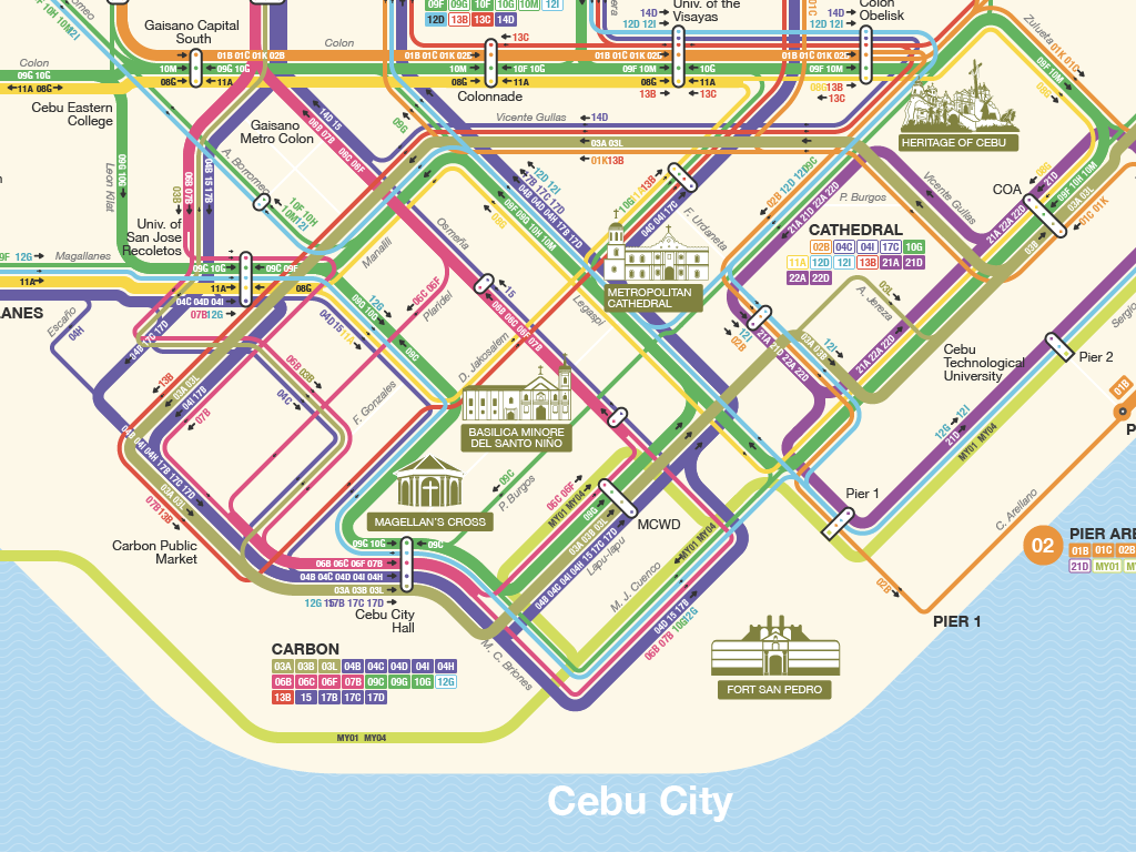
Simplifying Navigation to Help Locals and Tourists in Cebu
Custom transit map of Cebu City's jeepney network designed using QGIS and Illustrator — applying metro map principles to make public transport legible for locals and tourists.
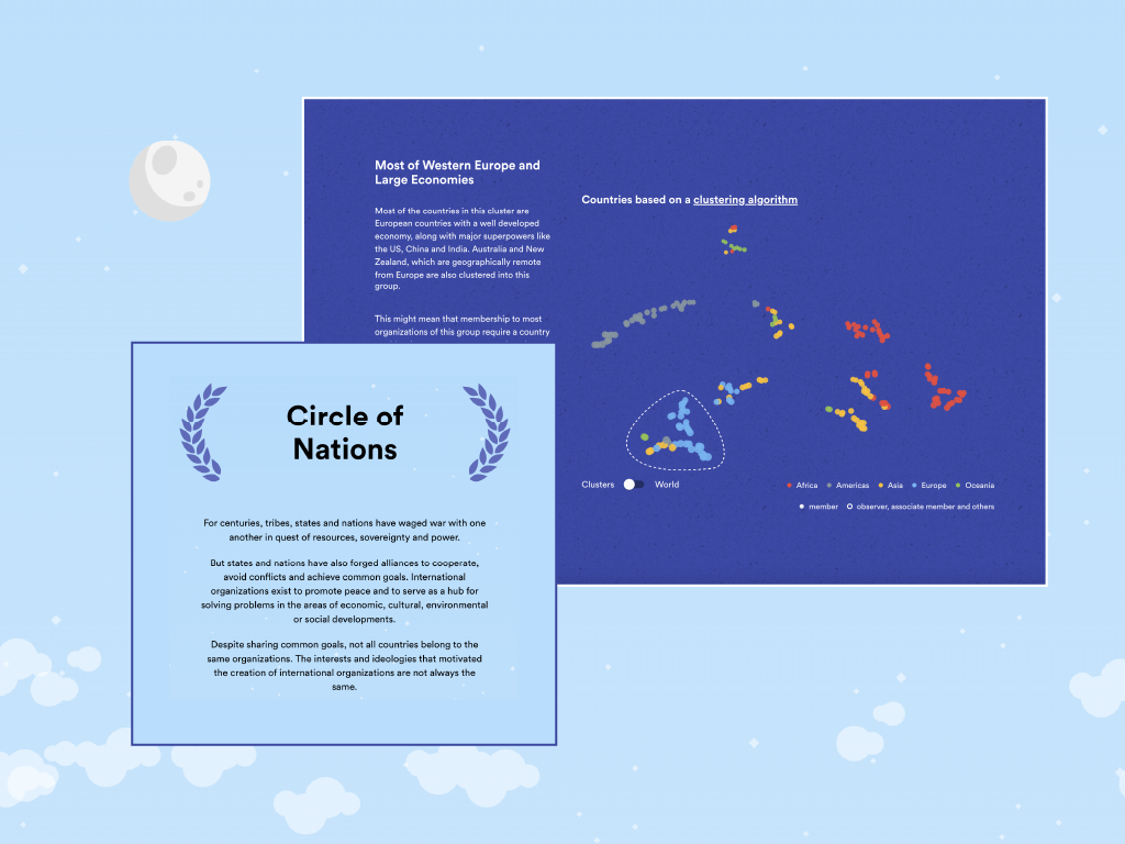
Exploring The Rifts and Bonds Between International Relationships
Interactive D3.js and React network visualization mapping relationships between global countries — built as a scrollytelling internship project for Interactive Things, Zurich.
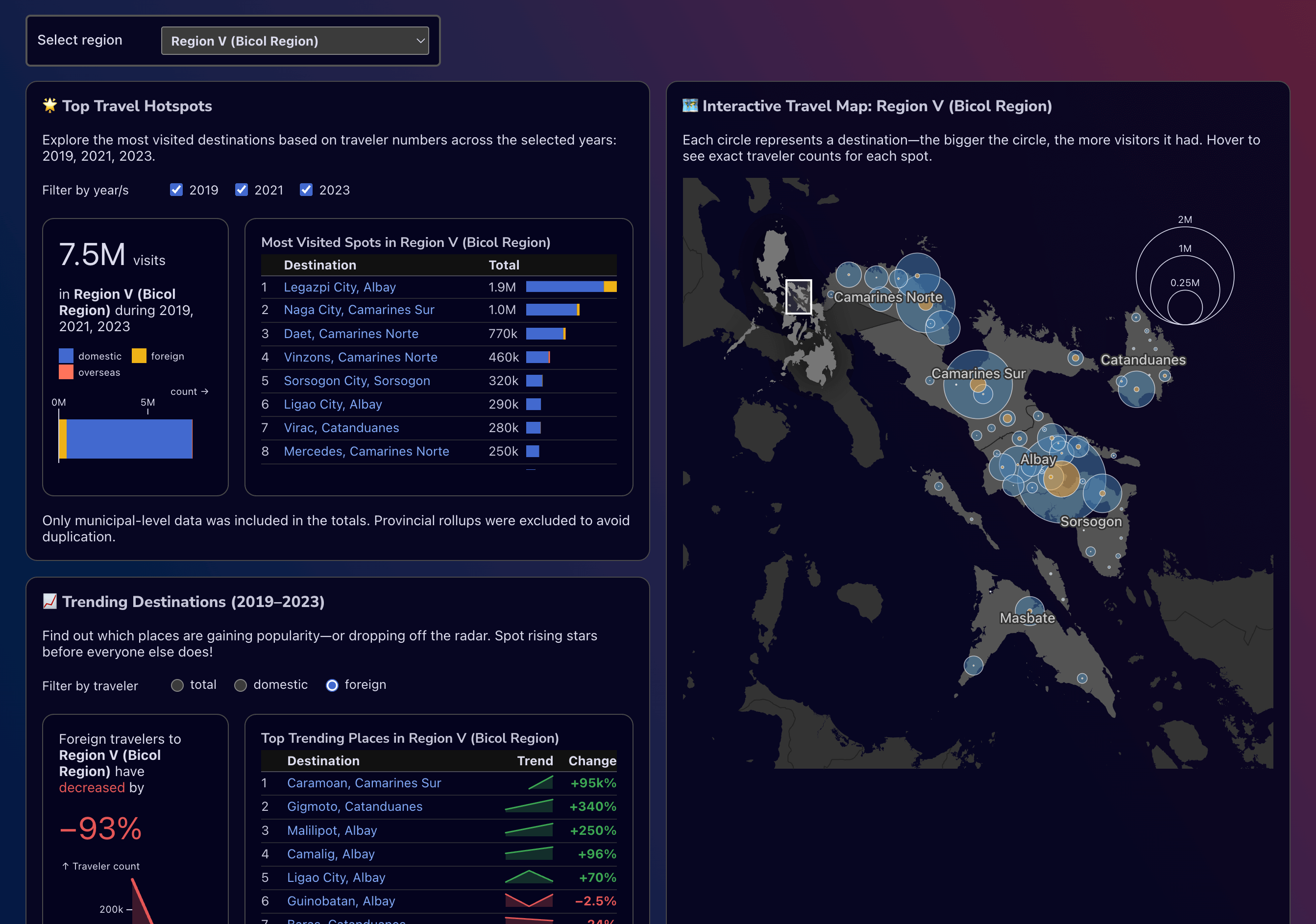
Visualizing Tourism Trends in the Philippines
An static data-driven report showcasing the state of tourism in the Philippines using publicly available data from 2014 to 2018.